Making an educational product as accessible as a streaming platform
I strengthened the product’s commercial positioning by redesigning the digital experience with inspiration from streaming platforms, making a technical educational service clearer, more attractive, and easier to sell.
Context and Challenge
Business Goals and Product Challenges
Virtual Library serves more than 3 million users across 400 plus institutions, operating under a B2B2C model.
After a technical platform renewal and the launch of a new app, the existing website no longer represented the product and began limiting conversion and commercial communication.
The challenge was to translate a complex service, including catalog depth, licensing, access models, and institutional contracts, into a simple, attractive, conversion oriented experience without losing technical credibility.
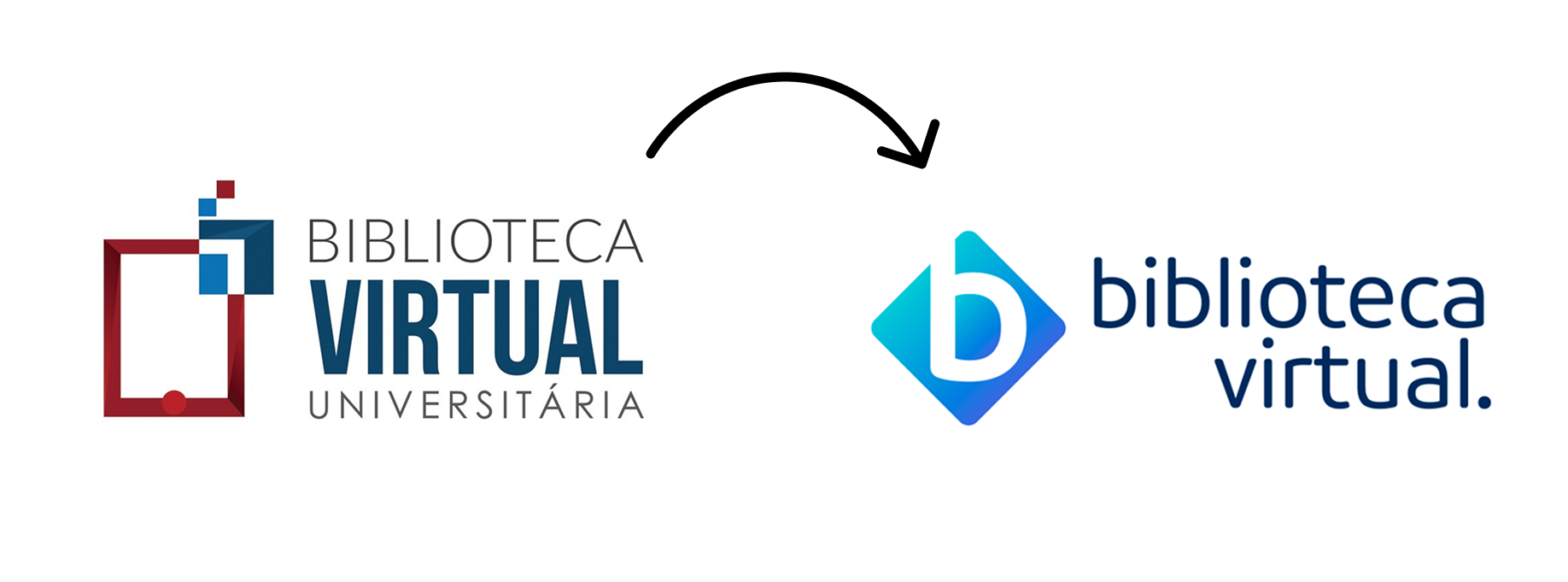
Brand update
Strong product, weak communication
Key Insights
Discovery, Research, and Synthesis
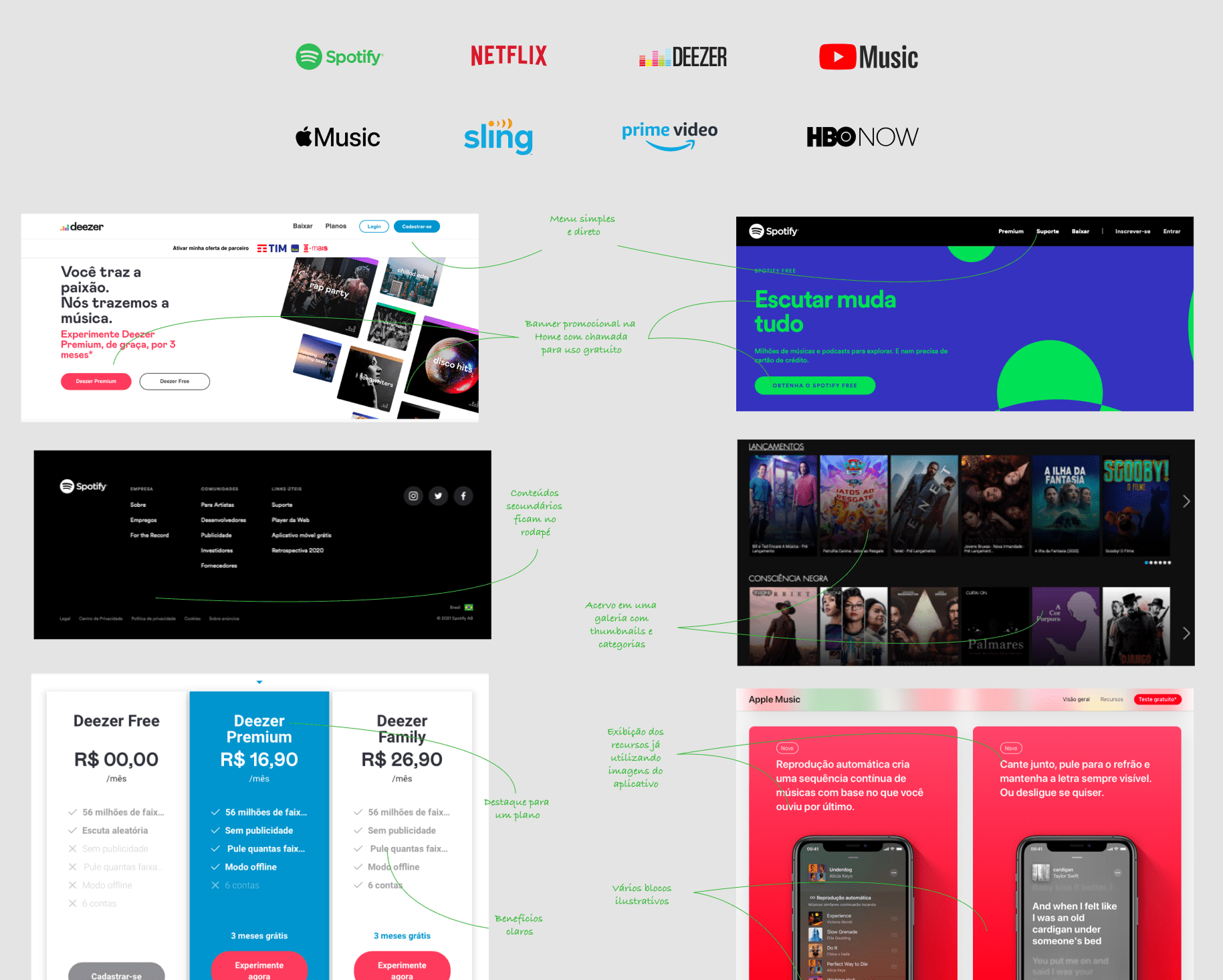
Benchmarking against streaming and digital reading platforms revealed a central insight:
“Users already understand the streaming consumption model. The barrier was overly technical educational language.”
By simplifying the narrative and structuring the experience around catalog discovery, perceived complexity dropped consistently without changing the product itself.
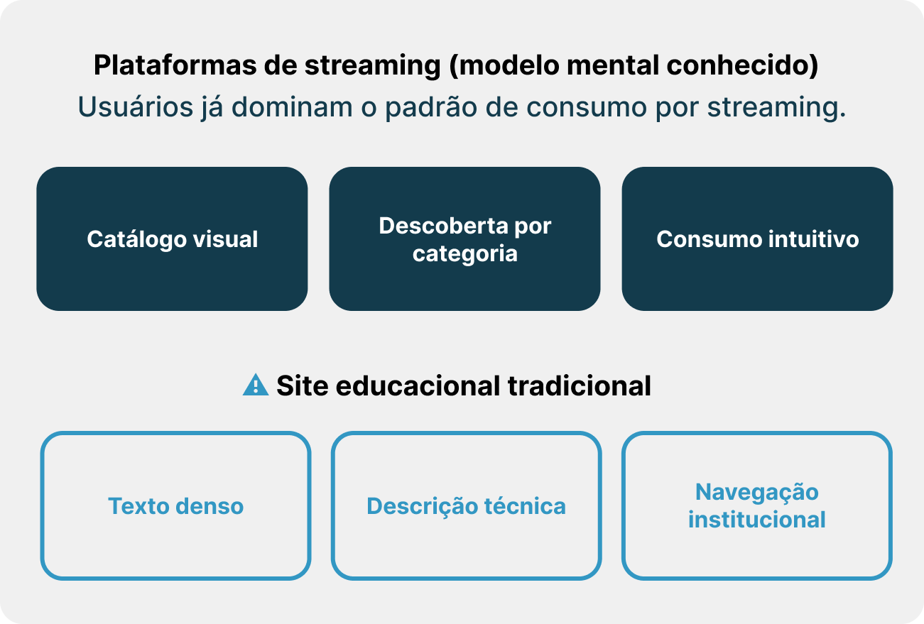
Mental model
Benchmark
Strategic Decision
Product Strategy and Solution Prioritization
The decision was to anchor the experience in established mental models.
The strategy defined:
Architecture inspired by streaming platforms
Discovery oriented content navigation
Clear, commercial, and contemporary visual language
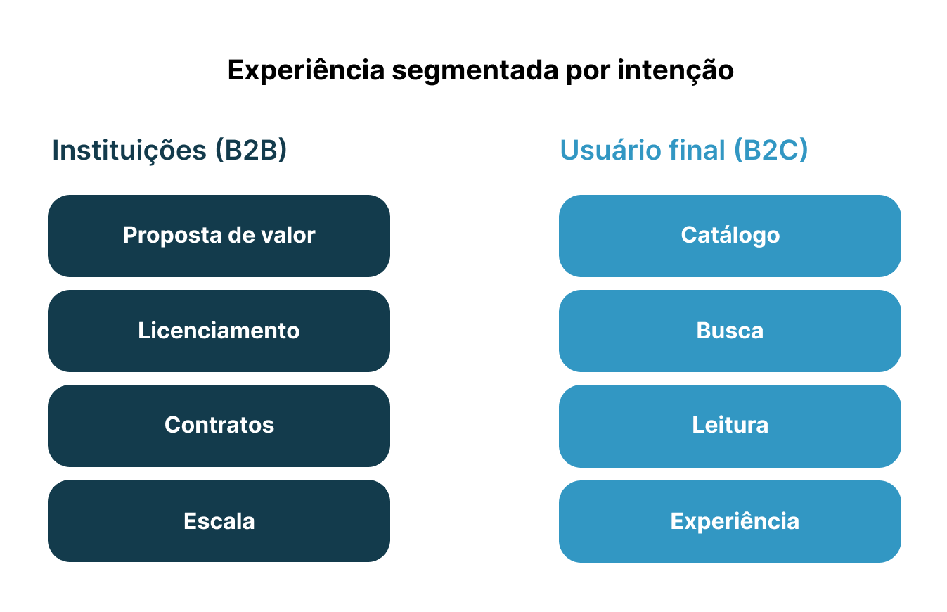
Distinct journeys for institutions and end users
Approaches focused only on technical descriptions were discarded, as they maintained cognitive barriers to conversion.
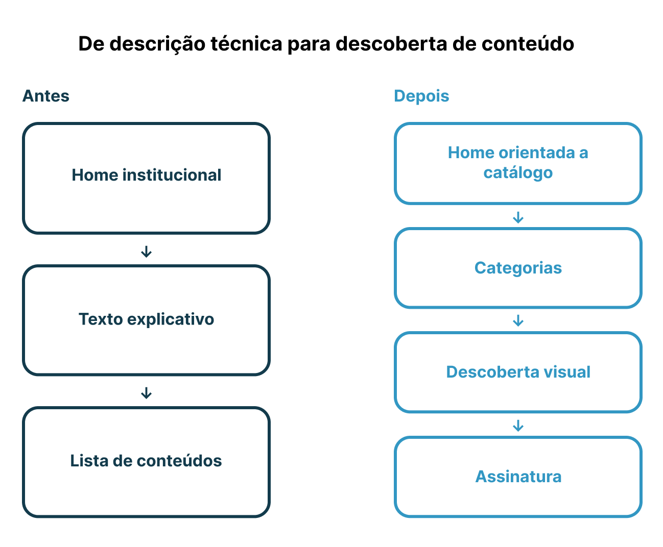
Structural transition
Two separate journeys
Execution & Design
Solution Execution and Experience Design
With the strategy defined, the work included:
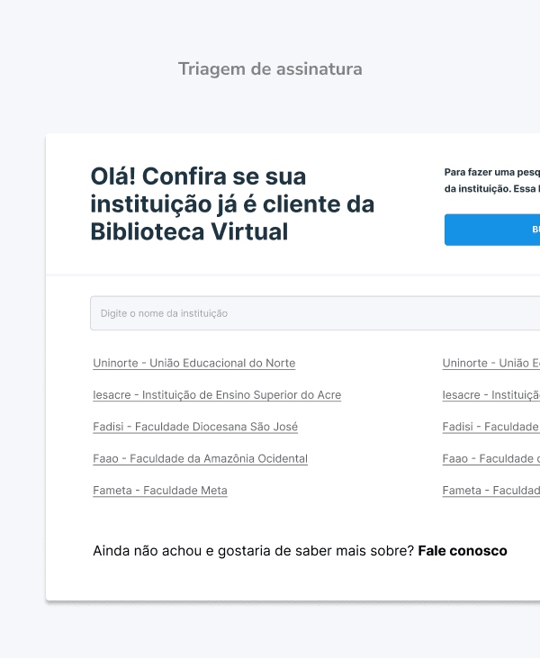
Conversion oriented information architecture focused on findability
Mapping of critical paths across catalog, search, subscription, and differentiators
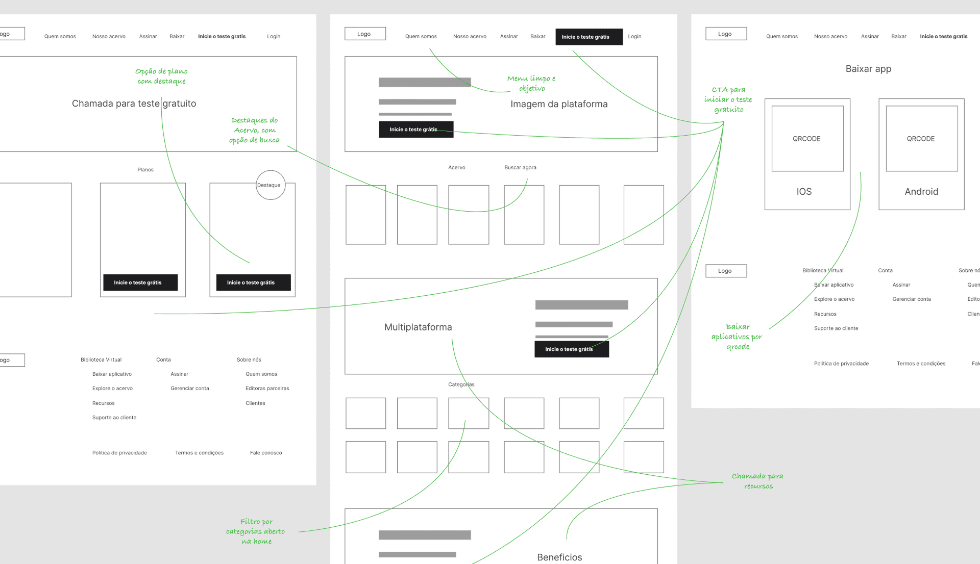
Low fidelity wireframes for structural validation
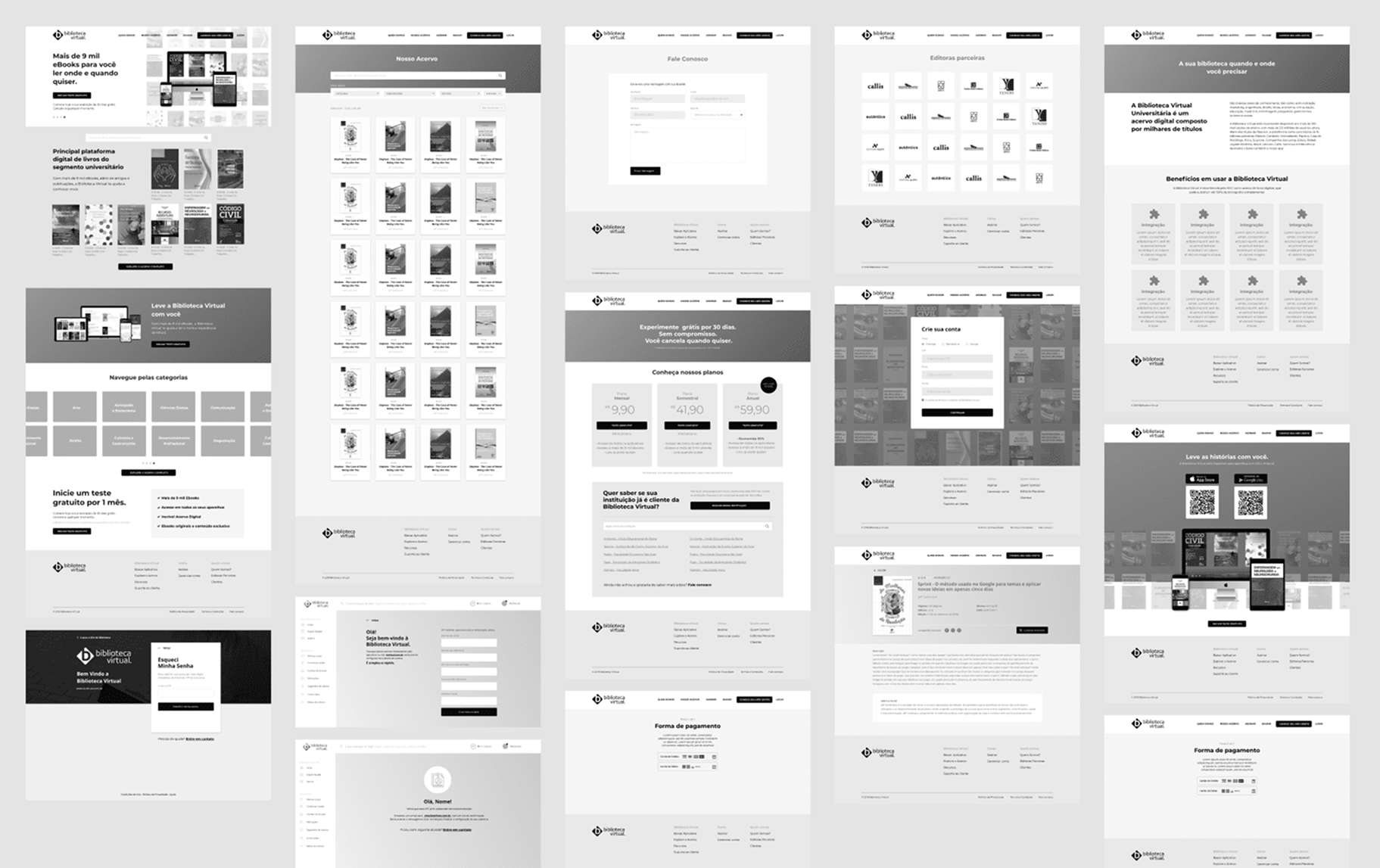
Mid and high fidelity prototyping focused on visual hierarchy and fast reading
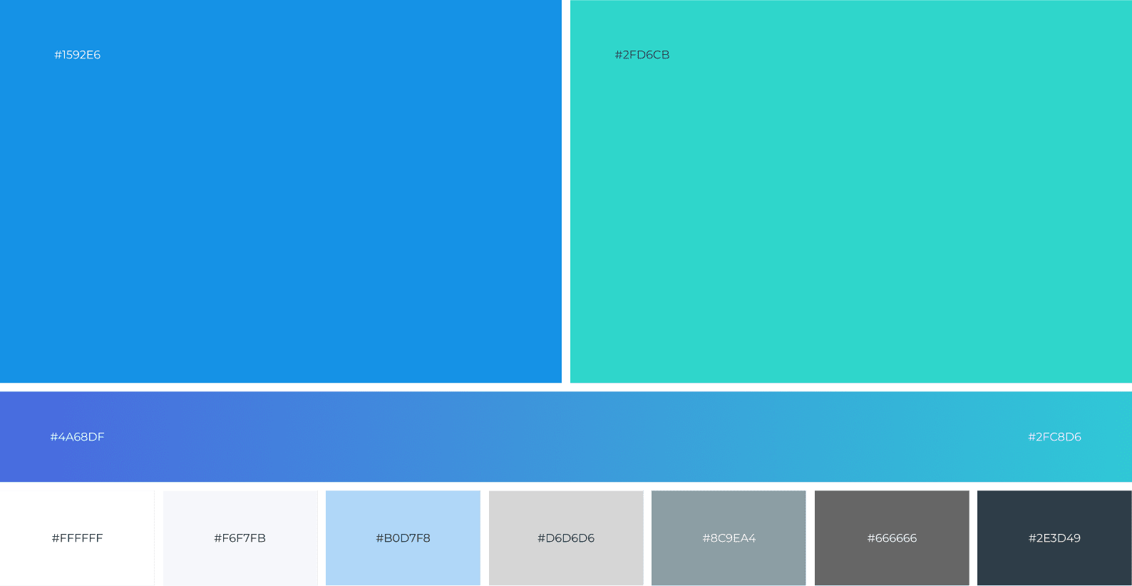
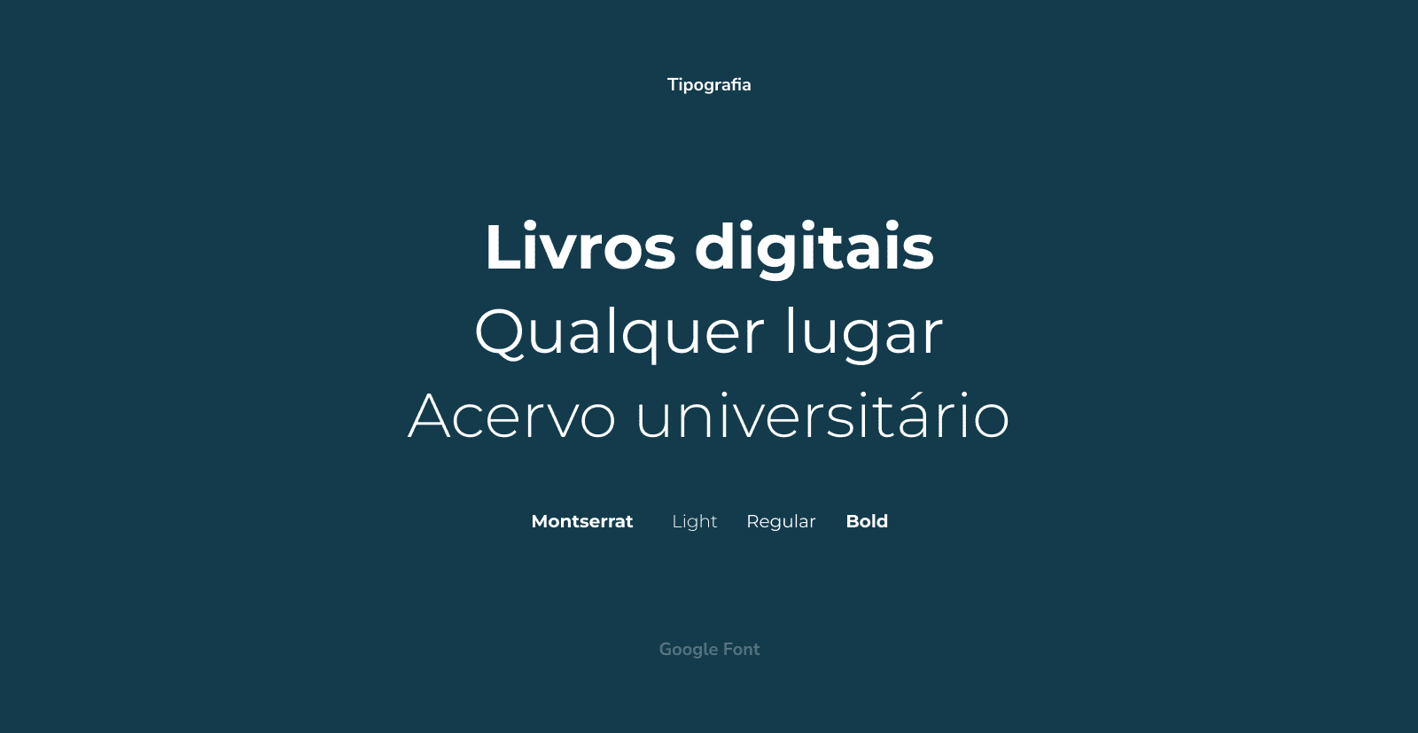
Definition of visual identity with colors, typography, and icons aligned with an innovation driven proposition
The work considered catalog expansion and new offerings, ensuring a foundation for growth.
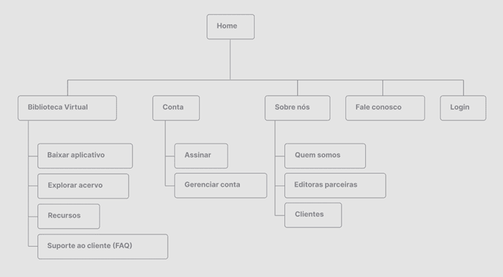
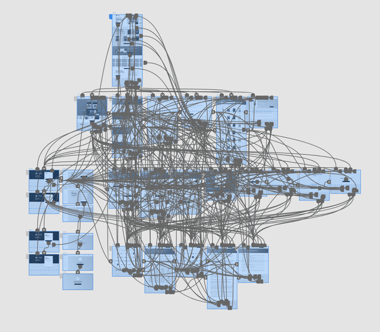
Site map
Sketches
Wireframes
Prototyping
Colors
Typography
User Validation
Data-Informed Iteration
Hypotheses were validated through:
Quick navigation tests with users
Evaluation of call to action clarity
Adjustments to information hierarchy and visual language
Testing confirmed stronger product understanding and smoother navigation, especially for new users.
Strategic Reflection
Impact and Learnings
The site began operating as a strategic acquisition and positioning channel, not just an institutional showcase.
Earnings
Repositioned the product as a digital experience comparable to streaming platforms
Clearer value communication for technical and non technical audiences
Smoother navigation across catalog, search, and subscription
Architecture prepared for feature expansion and new audiences
The project reinforced a core insight:
Perceived value sustains acquisition as much as the product itself.
By aligning language, navigation, and commercial positioning, the platform began communicating its value directly to decision makers and end users.
This experience strengthened my work in B2B2C products, using design as a lever for acquisition and positioning.